Single cell data analysis workshop
Jon Thompson, Pers lab
2019-05-10 11:53:46
Last updated: 2019-05-10
Checks: 6 0
Knit directory: 190510-scWorkshop/
This reproducible R Markdown analysis was created with workflowr (version 1.3.0). The Checks tab describes the reproducibility checks that were applied when the results were created. The Past versions tab lists the development history.
Great! Since the R Markdown file has been committed to the Git repository, you know the exact version of the code that produced these results.
Great job! The global environment was empty. Objects defined in the global environment can affect the analysis in your R Markdown file in unknown ways. For reproduciblity it’s best to always run the code in an empty environment.
The command set.seed(20190507) was run prior to running the code in the R Markdown file. Setting a seed ensures that any results that rely on randomness, e.g. subsampling or permutations, are reproducible.
Great job! Recording the operating system, R version, and package versions is critical for reproducibility.
Nice! There were no cached chunks for this analysis, so you can be confident that you successfully produced the results during this run.
Great! You are using Git for version control. Tracking code development and connecting the code version to the results is critical for reproducibility. The version displayed above was the version of the Git repository at the time these results were generated.
Note that you need to be careful to ensure that all relevant files for the analysis have been committed to Git prior to generating the results (you can use wflow_publish or wflow_git_commit). workflowr only checks the R Markdown file, but you know if there are other scripts or data files that it depends on. Below is the status of the Git repository when the results were generated:
Untracked files:
    Untracked:  data/filtered_gene_bc_matrices/
    Untracked:  data/pbmc3k_filtered_gene_bc_matrices.tar.gz
    Untracked:  output/seu_pbmc_tutorial.rds
Note that any generated files, e.g. HTML, png, CSS, etc., are not included in this status report because it is ok for generated content to have uncommitted changes.
These are the previous versions of the R Markdown and HTML files. If you’ve configured a remote Git repository (see ?wflow_git_remote), click on the hyperlinks in the table below to view them.
| File | Version | Author | Date | Message |
|---|---|---|---|---|
| Rmd | c43c860 | JonThom | 2019-05-10 | wflow_publish(“./analysis/analysis.Rmd”) |
| html | 8e26642 | JonThom | 2019-05-10 | Build site. |
| html | 8157790 | JonThom | 2019-05-10 | Build site. |
| Rmd | 7aa71e4 | JonThom | 2019-05-10 | wflow_publish(“./analysis/analysis.Rmd”) |
| html | 1d5ea1f | JonThom | 2019-05-10 | Build site. |
| Rmd | 0b4f952 | JonThom | 2019-05-10 | wflow_publish(“./analysis/analysis.Rmd”) |
| html | 966c250 | JonThom | 2019-05-10 | Build site. |
| Rmd | 6acaec4 | JonThom | 2019-05-10 | publish |
| html | 1bfc8f1 | JonThom | 2019-05-10 | Build site. |
| Rmd | 080696f | JonThom | 2019-05-10 | wflow_publish(“./analysis/analysis.Rmd”) |
| html | 7c8ff3e | JonThom | 2019-05-10 | Build site. |
| Rmd | 9934dbb | JonThom | 2019-05-10 | publish |
| html | 11811b9 | JonThom | 2019-05-09 | Build site. |
| Rmd | 25d1dfc | JonThom | 2019-05-09 | working draft |
| html | ed6f27a | JonThom | 2019-05-09 | Build site. |
| html | fcf3e91 | JonThom | 2019-05-09 | Build site. |
| Rmd | eb3e7f5 | JonThom | 2019-05-09 | wflow_publish(files = “./analysis/analysis.Rmd”) |
| html | 129883b | JonThom | 2019-05-07 | Build site. |
| Rmd | a906718 | JonThom | 2019-05-07 | add first analysis file |
A lightly adapted and annotated version of Satija et al, Guided Clustering Tutorial (2019)
- Seurat is an open source R package developed by Rahul Satija’s group at New York University, first released spring 2015
- Widely used and under active development
- Seurat is part of an ecosystem of R packages
- e.g. Seurat is built on ggplot2
- specialized tools like DoubletFinder or SoupX are built on Seurat
- There are great tutorials available on Satija group website
This tutorial covers the standard steps of QC, pre-processing and selecting features (genes), reducing the dimensionality of your dataset, clustering cells, and finding differentially expressed features.
Seurat has many other tools, notably for integrating different datasets, which other presenters will cover today.
Download the script for this tutorial at github
Set up
install and load packages
pkgs_required <- c("Seurat", "dplyr")

pkgs_new <- pkgs_required[!(pkgs_required %in% installed.packages()[, "Package"])]

if (length(pkgs_new)>0) install.packages(pkgs_new)

suppressPackageStartupMessages(library(Seurat))
suppressPackageStartupMessages(library(dplyr))
Set standard options
options(warn=1, stringsAsFactors = F)Define constants
# Define random seed for reproducibility
randomSeed = 12345
set.seed(seed=randomSeed)
Load data and initialize the Seurat Object
For this tutorial, we will be analyzing the a dataset of Peripheral Blood Mononuclear Cells (PBMC) freely available from 10X Genomics. There are 2,700 single cells that were sequenced on the Illumina NextSeq 500 and aligned to the human genome using Cell Ranger.
Reading in data
Seurat takes as input a gene (row) * cell (column) matrix of transcript counts.
The Read10X function reads in the output of the cellranger pipeline from 10X, returning a unique molecular identified (UMI) count matrix.
Seurat also provides the function ReadAlevin for loading the binary format matrix produced by the Alevin tool from the Salmon software.
- Before loading the filtered matrix, you should be confident that previous filtering steps were sound. If using
Cell Ranger, inspect the outputs carefully to see if the cut for calling barcodes as cells seems reasonable. If not, consider using the unfiltered matrix and filtering manually e.g. on a minimum number of RNA counts per cell.
# Load the PBMC dataset
pbmc.data <- Read10X(data.dir = "/projects/jonatan/applied/190510-scWorkshop/data/filtered_gene_bc_matrices/hg19/")
Create a Seurat object
We next use the count matrix to create a Seurat object, which serves as a container for data (like the count matrix) and analysis (like PCA, or clustering results).
# Initialize the Seurat object with the raw (non-normalized data).
pbmc <- suppressWarnings({
  CreateSeuratObject(counts = pbmc.data,
                     project = "pbmc3k",
                     min.cells = 3, # set minimum number of cells for genes
                     min.features = 200) # set minimum number of features (genes) for cells
  })
pbmc
An object of class Seurat
13714 features across 2700 samples within 1 assay
Active assay: RNA (13714 features)Seurat provides convenience functions to access data in the object:
GetAssayData(pbmc, slot="counts")[0:5,0:3]5 x 3 sparse Matrix of class "dgCMatrix"
AAACATACAACCAC AAACATTGAGCTAC AAACATTGATCAGC
AL627309.1 . . .
AP006222.2 . . .
RP11-206L10.2 . . .
RP11-206L10.9 . . .
LINC00115 . . .In addition, you can always access any slot in the object using the ‘@’ and ‘$’ operators:
pbmc@assays$RNA@counts[0:5,0:3]5 x 3 sparse Matrix of class "dgCMatrix"
AAACATACAACCAC AAACATTGAGCTAC AAACATTGATCAGC
AL627309.1 . . .
AP006222.2 . . .
RP11-206L10.2 . . .
RP11-206L10.9 . . .
LINC00115 . . .For a technical discussion of the Seurat object structure, check out the GitHub Wiki.
QC and normalization
Standard pre-processing workflow: filter cells based on QC metrics
Seurat allows you to easily explore QC metrics and filter cells based on any user-defined criteria.
A few QC metrics commonly used by the community include
- The number of unique genes or molecules detected in each cell.
- Low-quality cells or empty droplets will often have very few genes
- Cell doublets or multiplets may exhibit an aberrantly high gene count
- The percentage of counts that map to the mitochondrial genome. Low-quality / dying cells often exhibit extensive mitochondrial contamination
- Depending on the particular experiment, other indicators might include e.g. proportion of counts mapping to the ribosomal genome, in some cases a marker for cell stress.
- Exercise caution! According to 10x Genomics, for PBMCs approximately 35-40% of reads map to ribosomal transcripts. Mitochrondrial RNA content also varies by celltype and condition.
mito.genes <- grepl(pattern = "^mt-", x = rownames(pbmc), ignore.case=T)

mat_counts <- GetAssayData(object = pbmc, assay="RNA", slot = "counts") %>% as.matrix

colSums_tmp <- colSums(x = mat_counts)

pbmc[["percent.mt"]] = colSums(x = mat_counts[mito.genes,])/colSums_tmp

head(pbmc@meta.data)
orig.ident nCount_RNA nFeature_RNA percent.mt
AAACATACAACCAC pbmc3k 2419 779 0.030177759
AAACATTGAGCTAC pbmc3k 4903 1352 0.037935958
AAACATTGATCAGC pbmc3k 3147 1129 0.008897363
AAACCGTGCTTCCG pbmc3k 2639 960 0.017430845
AAACCGTGTATGCG pbmc3k 980 521 0.012244898
AAACGCACTGGTAC pbmc3k 2163 781 0.016643551# Visualize QC metrics as a violin plot
VlnPlot(pbmc,
features = c("nFeature_RNA", "nCount_RNA", "percent.mt"),
ncol = 3)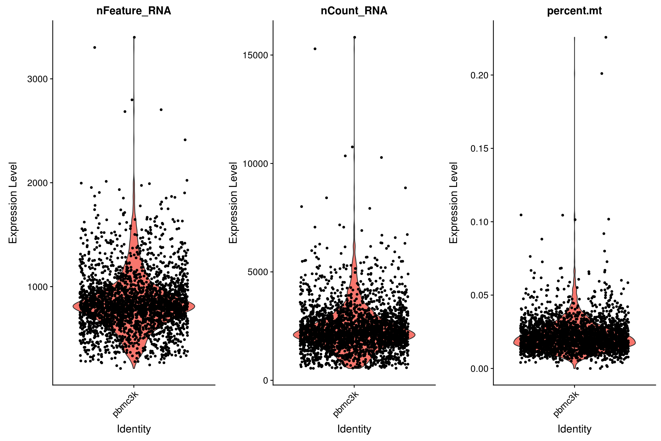
# FeatureScatter is typically used to visualize feature-feature relationships, but can be used
# for anything calculated by the object, i.e. columns in object metadata, PC scores etc.

FeatureScatter(pbmc, feature1 = "nCount_RNA", feature2 = "percent.mt")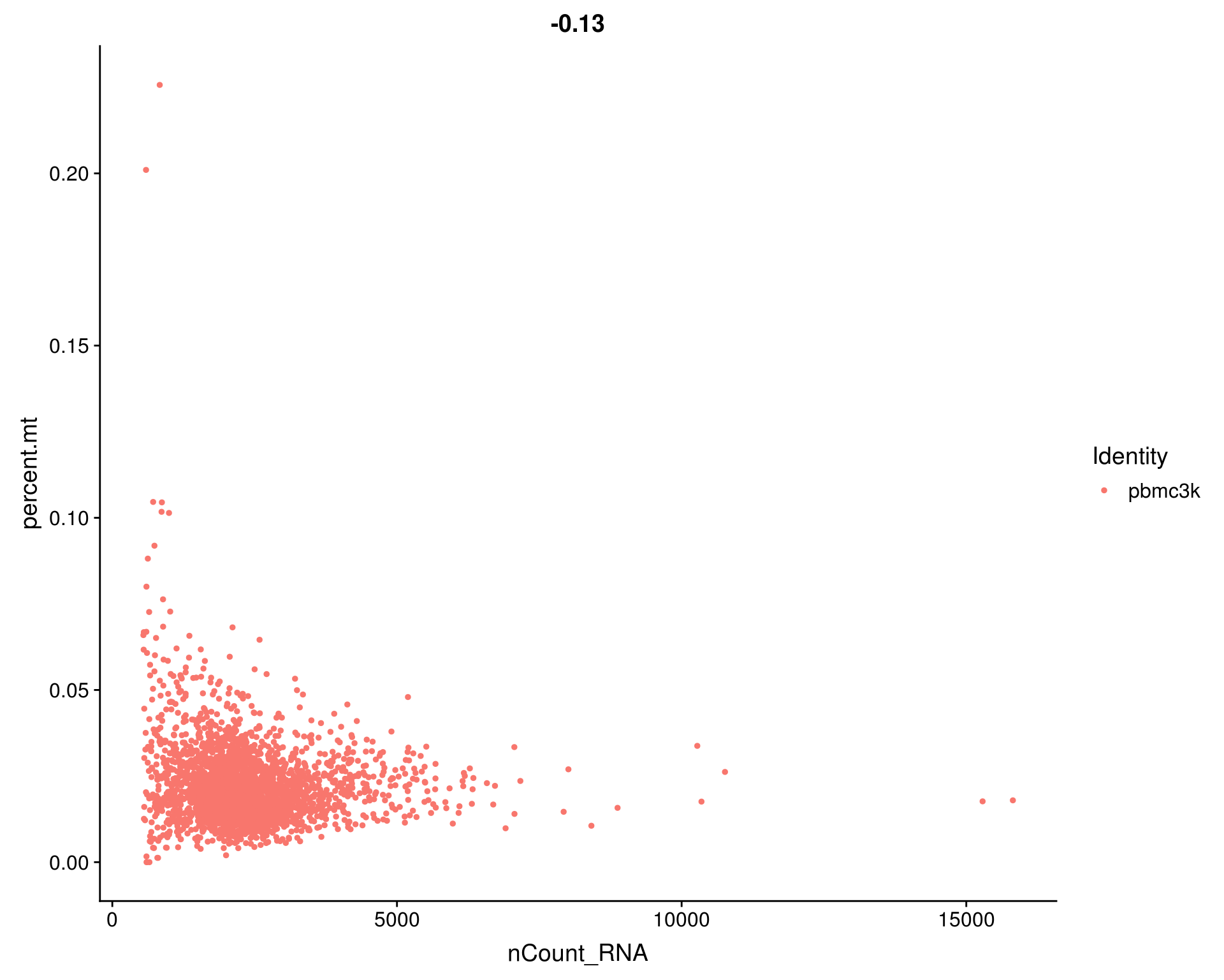
# plot1 <- FeatureScatter(pbmc, feature1 = "nCount_RNA", feature2 = "percent.mt")
# plot2 <- FeatureScatter(pbmc, feature1 = "nCount_RNA", feature2 = "nFeature_RNA")
# CombinePlots(plots = list(plot1, plot2))- We filter cells that have unique feature counts over 2,500 (indicating a possible multiplet) or fewer than 200
- We filter cells that have >5% mitochondrial counts
pbmc <- subset(pbmc,
               subset = nFeature_RNA > 200 &
                 nFeature_RNA < 2500 &
                 percent.mt < 0.05)

head(pbmc@meta.data)
orig.ident nCount_RNA nFeature_RNA percent.mt
AAACATACAACCAC pbmc3k 2419 779 0.030177759
AAACATTGAGCTAC pbmc3k 4903 1352 0.037935958
AAACATTGATCAGC pbmc3k 3147 1129 0.008897363
AAACCGTGCTTCCG pbmc3k 2639 960 0.017430845
AAACCGTGTATGCG pbmc3k 980 521 0.012244898
AAACGCACTGGTAC pbmc3k 2163 781 0.016643551LogNormalize the raw counts
After removing unwanted cells from the dataset, the next step is to normalize the data.
By default, we employ a global-scaling normalization method LogNormalize that
- normalizes the feature expression measurements for each cell by the total number of counts within the cell and scales this by a common factor (10,000 by default) corresponding to the expected number of reads in a cell
- assumption: differences in total number of RNA are due to more varying sampling depth than to biology.
- adds 1 and log-transforms (natural log) the result.
- assumption: raw counts are highly skewed to the right and log brings them closer to Normality, which is useful for PCA and statistical tests.
Normalized values are stored in pbmc@assays$RNA@data.
pbmc <- NormalizeData(pbmc,
                      normalization.method = "LogNormalize",
                      scale.factor = 10000)

pbmc@assays$RNA@data[10000:10005,0:3]
6 x 3 sparse Matrix of class "dgCMatrix"
AAACATACAACCAC AAACATTGAGCTAC AAACATTGATCAGC
HDGFRP3 . . .
ZSCAN2 . . .
WDR73 . . .
NMB . . .
SEC11A 1.635873 . 1.429744
ZNF592 . . . Identify highly variable features (feature selection)
We next calculate a subset of features that exhibit high cell-to-cell variation in the dataset (i.e, they are highly expressed in some cells, and lowly expressed in others). Satija et al and others have found that focusing on these genes in downstream analysis helps to highlight biological signal in single-cell datasets.
Problem: gene expression variance tends to correlate highly with the mean expression, leading to a bias towards selecting highly expressed genes
Variance Stabilizing Transformation (vst):
- The procedure in Seurat3 is described in detail here
- The method fits a line to the relationship of log(variance) and log(mean) across all genes using local polynomial regression (loess). Then standardizes each gene’s variance using the observed mean and expected variance (given by the fitted line). To reduce the impact of technical outliers, we clip the standardized values to a maximum value (clip.max).
- This method returns the number of genes requested (default 2000)
pbmc <- FindVariableFeatures(pbmc,
                             selection.method = "vst",
                             nfeatures = 2000)
# Identify the 10 most highly variable genes
top10 <- head(VariableFeatures(pbmc), 10)
# plot variable features with and without labels
plot1 <- VariableFeaturePlot(pbmc)
plot2 <- LabelPoints(plot = plot1, points = top10, repel = TRUE)When using repel, set xnudge and ynudge to 0 for optimal resultsCombinePlots(plots = list(plot1, plot2))Warning: Transformation introduced infinite values in continuous x-axis
Warning: Transformation introduced infinite values in continuous x-axis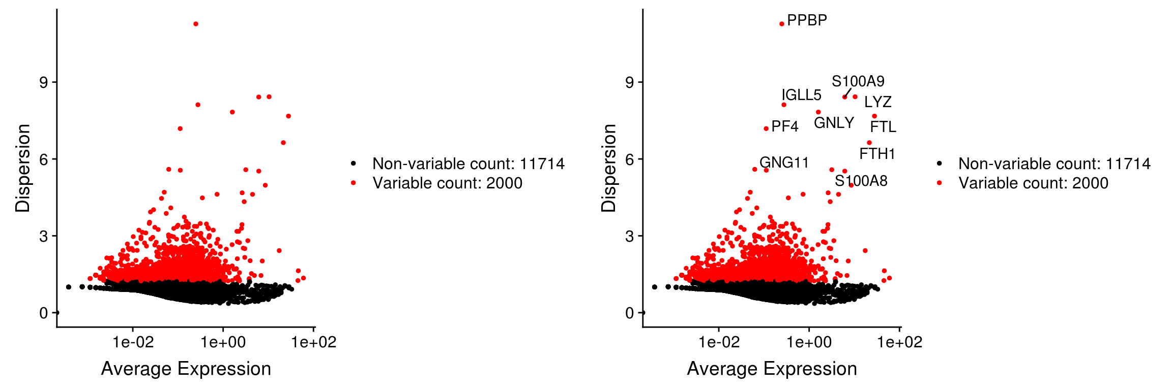
| Version | Author | Date |
|---|---|---|
| fcf3e91 | JonThom | 2019-05-09 |
Scale and center the data
Next, as a standard pre-processing step prior to dimensional reduction techniques like PCA, we center and scale each gene’s expression
- This step gives equal weight in downstream analyses, so that highly-expressed genes do not dominate.
In addition, the ScaleData function optionally also ‘regresses out’ effects of given confounders, such as the number of RNA molecules or the proportion of mitochrondrial RNA Hafemeister (2017). However one should proceed with caution, in case the ‘confounder’ is correlated with biological variables of interest.
The results of this are stored in pbmc@assays$RNA@scale.data
Note:
- Scaling only makes sense as pre-processing for Principal Component Analysis (PCA); for other analysis continue to use LogNormalized data (
pbmc@assays$RNA@data) or raw counts (pbmc@assays$RNA@counts)
pbmc <- ScaleData(pbmc,
                  verbose = T,
                  vars.to.regress = c("nCount_RNA", "percent.mt"))
Regressing out nCount_RNA, percent.mtScaling data matrixpbmc@assays$RNA@scale.data[0:5,0:3] AAACATACAACCAC AAACATTGAGCTAC AAACATTGATCAGC
PPBP -0.1521894 -0.03564544 -0.08450815
LYZ -0.2679889 -0.82318984 0.08203817
S100A9 -0.8027624 -1.21493665 -0.55611741
IGLL5 -0.1949180 -0.12315643 -0.13727433
GNLY -0.4260540 -0.21637331 0.85483132- Contrary to the documentation (see
?ScaleData), the function by default scales only highly variable genes
dim(pbmc@assays$RNA@scale.data)[1] 2000 2638If you wish to use all genes for PCA, pass the argument features = rownames(pbmc)
Dimensionality reduction and clustering
Perform linear dimensional reduction
Next we perform Principal Component Analysis (PCA) on the scaled data.
By default, only the highly variable features are used to compute PCA, but can be defined using features argument if you wish to choose a different subset (such as all genes), providing that you have run ScaleData on these genes.
- Since the PCA algorithm uses a pseudorandom algorithm, provide the
seed.useargument for reproducibility.
pbmc <- RunPCA(pbmc,
               npcs=30, #number of principal components
               features = VariableFeatures(object = pbmc),
               verbose=F,
               #ndims.print = 1:3, # number of PCs to print
               #nfeatures.print = 10, # number of highly loading genes to print
               seed.use=randomSeed)
DimPlot(pbmc, reduction = "pca")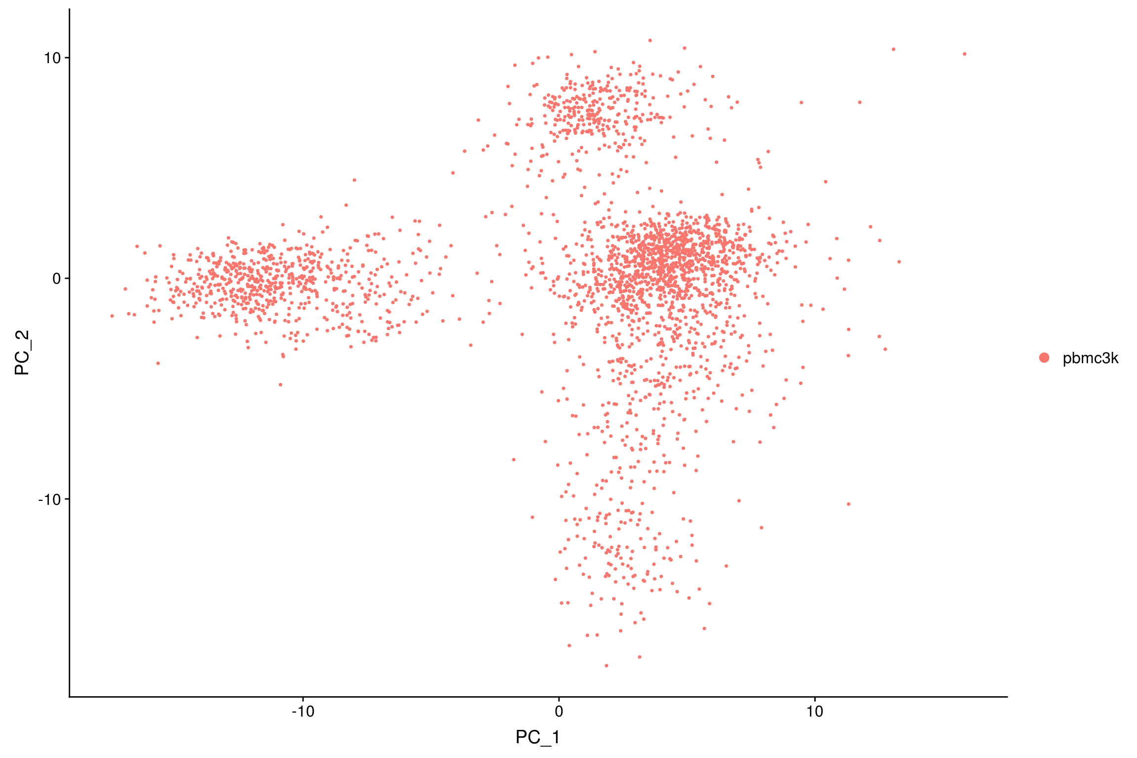
| Version | Author | Date |
|---|---|---|
| fcf3e91 | JonThom | 2019-05-09 |
Determine the ‘real dimensionality’ of the dataset
Seurat clusters cells based on their PCA scores. How many components should we use? 10? 20? 50?
Seurat provides three approaches to selecting the number of PCs:
- Select PCs based on whether interesting genes score highly on them (supervised)
JackStraw: use a statistical test based on a random null model to determine which PCs capture ‘real’ variation versus noise. Time-consuming but unsupervised and rigourous.ElbowPlot: Use an elbow plot to select PCs that explain most of the variance in the dataset. A fast heuristic that is commonly used.
Select PCs based on interesting genes
Seurat provides several useful ways of visualizing both cells and features that define the PCA, including VizDimLoadings, VizDimReduction, DimPlot, and DimHeatmap
VizDimLoadings(pbmc, dims = 1:2, reduction = "pca")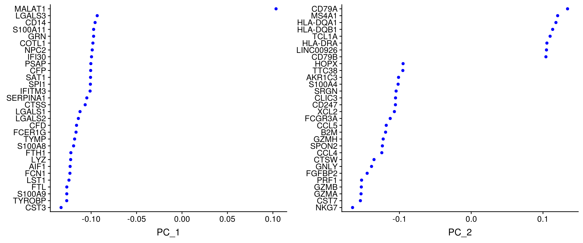
| Version | Author | Date |
|---|---|---|
| fcf3e91 | JonThom | 2019-05-09 |
DimHeatmap plots expression levels in cells and features, ordered according to their PCA scores. The function plots the ‘extreme’ cells on both ends of the spectrum.
- Note that principal components are just coordinate axes with an arbitrary sign. Hence the sign of a gene or cell ‘score’ on a component does not indicate whether or not the gene is highly or lowly expressed, which is why to look at both the highest and the lowest scoring cells and genes.
DimHeatmap(pbmc, dims = 1:15, cells = 500, balanced = TRUE)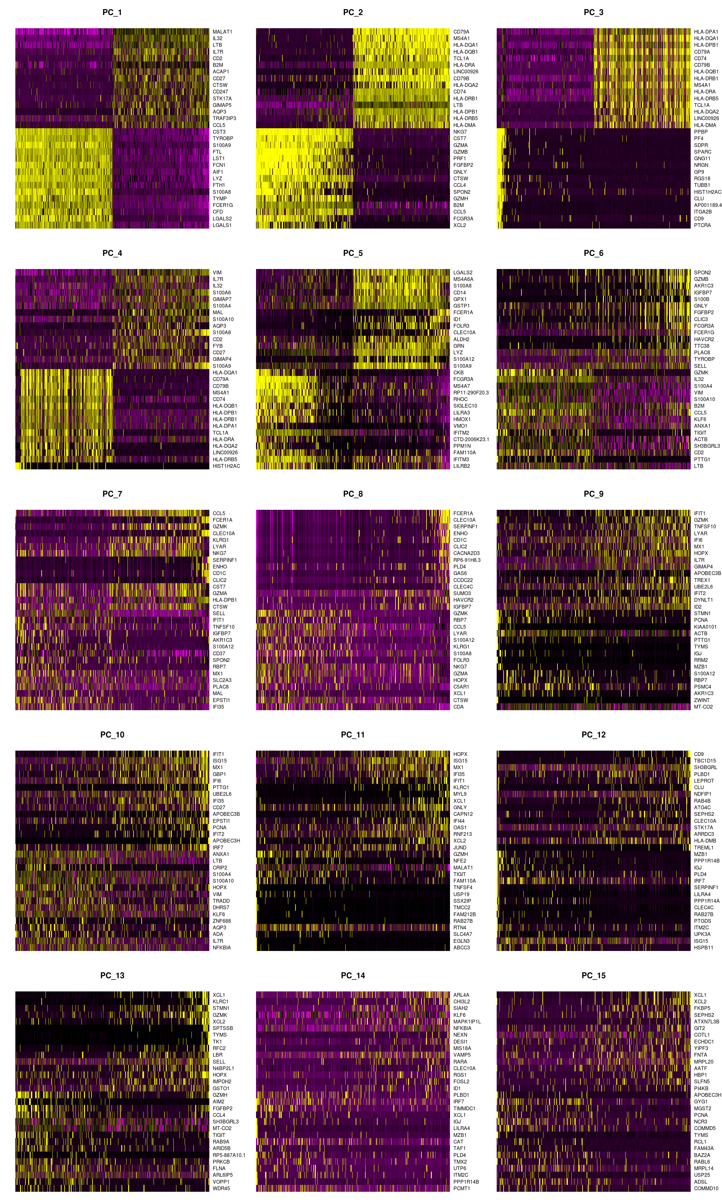
| Version | Author | Date |
|---|---|---|
| fcf3e91 | JonThom | 2019-05-09 |
JackStraw
In Macosko et al the authors implemented a resampling test inspired by Chung et al, Bioinformatics (2014)
For each gene
- Randomly ‘scramble’ the gene’s scores across cells and calculate projected PCA loadings for these ‘scambled’ genes. Do this many (200+) times.
- Compare the PCA scores for the ‘random’ genes with the observed PCA scores to obtain a p-value for each gene’s association with each principal component.
pbmc <- JackStraw(pbmc,
num.replicate = 200)- Use the p-values for each gene per PC to perform a proportion test comparing the number of features with a p-value below a particular threshold (score.thresh), compared with the proportion of features expected under a uniform distribution of p-values. This gives a p-value for each principal component.
pbmc <- ScoreJackStraw(pbmc,
                       dims = 1:20)
The JackStrawPlot function provides a visualization tool for comparing the distribution of p-values for each PC with a uniform distribution (dashed line). ‘Significant’ PCs will show a strong enrichment of features with low p-values (solid curve above the dashed line). In this case it appears that there is a sharp drop-off in significance after the first 10-12 PCs.
JackStrawPlot(pbmc, dims = 1:15)Warning: Removed 23405 rows containing missing values (geom_point).
| Version | Author | Date |
|---|---|---|
| fcf3e91 | JonThom | 2019-05-09 |
ElbowPlot
‘Elbow plot’: shows the percentage of variance explained by each PC. In this example, we can observe an ‘elbow’ around PCs 9-10, suggesting that the majority of true signal is captured in the first 10 PCs.
ElbowPlot(pbmc)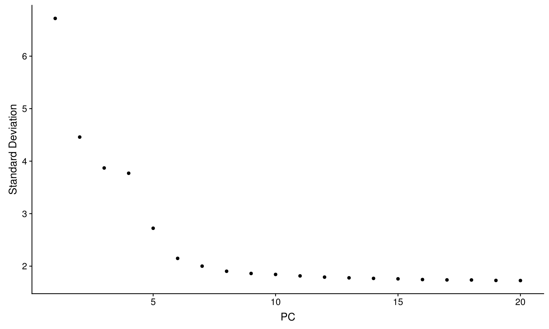
| Version | Author | Date |
|---|---|---|
| fcf3e91 | JonThom | 2019-05-09 |
In this example, all three approaches yielded similar results, but we might have been justified in choosing anything between PC 7-12 as a cutoff.
We chose 10 here, but consider the following:
- The composition of the dataset has a large impact on the principal components.
- Insufficient filtering of cells with unexpectedly high mitochrondrial RNA (indicating cell death) or ribosomal RNA (in some settings indicating stress) may introduce a lot of ‘uninteresting’ variation that affects downstream results
- Rare celltypes with few cells will have low weight in the PCA. It is therefore useful to check the gene scores for markers.
- If unsure, err on the side of more PCs
Cluster the cells
Seurat v3 applies a graph-based clustering approach, building upon initial strategies in (Macosko et al). Importantly, the distance metric which drives the clustering analysis (based on previously identified PCs) remains the same as in previous Seurat versions. However, the approach to partioning the cellular distance matrix into clusters has dramatically improved. The approach was heavily inspired by recent manuscripts which applied graph-based clustering approaches to scRNA-seq data SNN-Cliq, Xu and Su, Bioinformatics, 2015 and CyTOF data PhenoGraph, Levine et al., Cell, 2015. Briefly, these methods embed cells in a graph structure - for example a K-nearest neighbor (KNN) graph, with edges drawn between cells with similar feature expression patterns, and then attempt to partition this graph into highly interconnected ‘quasi-cliques’ or ‘communities’.
As in PhenoGraph, we first construct a KNN graph based on the euclidean distance in PCA space, and refine the edge weights between any two cells based on the shared overlap in their local neighborhoods (Jaccard similarity). This step is performed using the FindNeighbors function, and takes as input the previously defined dimensionality of the dataset (first 10 PCs).
To cluster the cells, Seurat then applies modularity optimization techniques such as the Louvain algorithm (default) or SLM SLM, Blondel et al., Journal of Statistical Mechanics, to iteratively group cells together, with the goal of optimizing the standard modularity function.
The FindClusters function, which implements this procedure, contains a resolution parameter that sets the ‘granularity’ of the downstream clustering, with increased values leading to a greater number of clusters.
- Setting this parameter between 0.4-1.2 typically returns good results for single-cell datasets of around 3K cells. Optimal resolution often increases for larger datasets.
pbmc <- FindNeighbors(pbmc,
                      dims = 1:10) # use 10 Principal Components
Computing nearest neighbor graphComputing SNNpbmc <- FindClusters(pbmc,
resolution = 0.5) Modularity Optimizer version 1.3.0 by Ludo Waltman and Nees Jan van Eck
Number of nodes: 2638
Number of edges: 157834
Running Louvain algorithm...
Maximum modularity in 10 random starts: 0.8590
Number of communities: 9
Elapsed time: 0 seconds# Look at cluster IDs of the first 5 cells
head(Idents(pbmc), 5)AAACATACAACCAC AAACATTGAGCTAC AAACATTGATCAGC AAACCGTGCTTCCG AAACCGTGTATGCG
0 2 3 1 6
Levels: 0 1 2 3 4 5 6 7 8Run non-linear dimensional reduction (UMAP/tSNE)
Seurat offers several non-linear dimensional reduction techniques to visualize and explore these datasets, including
- t-distributed Stochastic Neighbour Embedding (t-SNE)
- Uniform Manifold Approximation and Projection (UMAP)
As input to the UMAP and tSNE, use the same PCs as used for the clustering analysis (here, the first 10)
For tSNE, the perplexity parameter (defaults to 30) has a large impact on the final plot. For a great discussion see Watternberg et al, 2016
As with RunPCA, specifying seed.use makes the reduction reproducible
# use tSNE because UMAP isn't installed :)
pbmc <- RunTSNE(pbmc,
                dims = 1:10,
                seed.use=randomSeed,
                perplexity=30,
                check_duplicates=F) # if not specified the function fails if two cells share coordinates
# note that you can set `label = TRUE` or use the LabelClusters function to help label
# individual clusters
DimPlot(pbmc,
reduction = "tsne")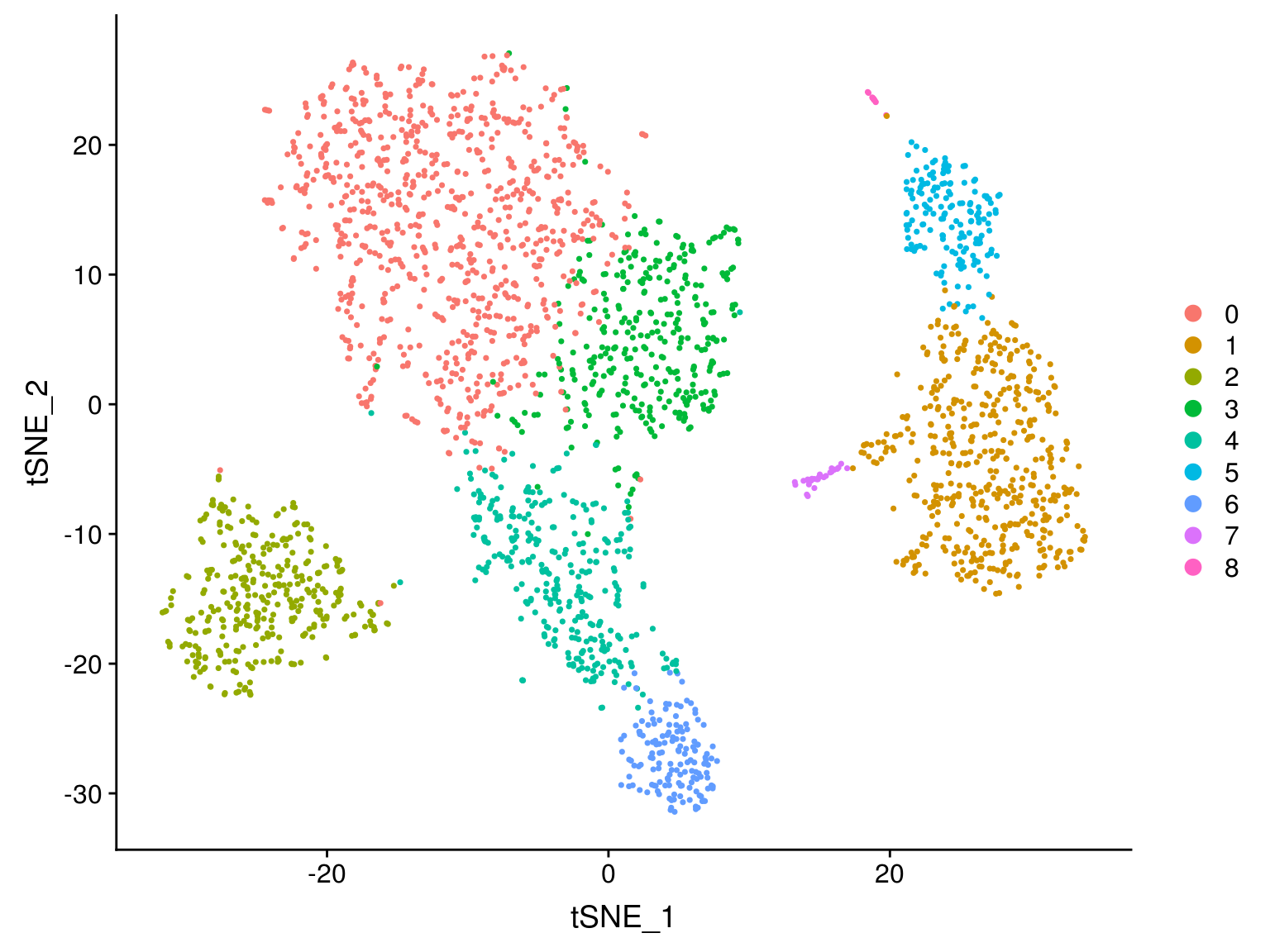
Biological analysis
Finding differentially expressed features (cluster biomarkers)
Seurat can help you find markers that define clusters via differential expression.
FindAllMarkers automates this process for all clusters, but you can also test groups of clusters vs. each other, or against all cells.
Seurat has several tests for differential expression which can be set with the test.use parameter (see the Seurat DE vignette for details).
Note that:
- By default, unless you specify otherwise
FindClustersidentifies positive and negative markers of a single cluster (specified in ident.1), compared to all other cells - The min.pct argument requires a feature to be detected at a minimum percentage in either of the two groups of cells
- The thresh.test argument requires a feature to be differentially expressed (on average) by some amount between the two groups.
- max.cells.per.ident will downsample each identity class, which can save much time
# find all markers of cluster 1
cluster1.markers <- FindMarkers(pbmc,
                                ident.1 = 1,
                                test.use  ="wilcox",
                                only.pos = T,
                                max.cells.per.ident=500,
                                random.seed=randomSeed,
                                min.pct = 0.25)
head(cluster1.markers, n = 5)
p_val avg_logFC pct.1 pct.2 p_val_adj
S100A8 1.720457e-165 3.796943 0.973 0.124 2.359435e-161
S100A9 3.451515e-165 3.854759 0.996 0.217 4.733407e-161
LYZ 3.362404e-160 3.143552 1.000 0.518 4.611201e-156
LGALS2 7.494708e-151 2.634321 0.907 0.061 1.027824e-146
TYROBP 3.918747e-147 2.100770 0.994 0.267 5.374170e-143# find all markers distinguishing cluster 5 from clusters 0 and 3
cluster5.markers <- FindMarkers(pbmc,
ident.1 = 5,
ident.2 = c(0, 3),
test.use ="wilcox",
only.pos = T,
max.cells.per.ident=500,
random.seed=randomSeed,
min.pct = 0.25)
head(cluster5.markers, n = 5) p_val avg_logFC pct.1 pct.2 p_val_adj
FCGR3A 1.419346e-121 2.901285 0.969 0.047 1.946491e-117
IFITM3 1.661439e-118 2.705380 0.975 0.057 2.278497e-114
CFD 2.030728e-117 2.355001 0.939 0.042 2.784940e-113
TYROBP 7.442123e-115 3.239007 1.000 0.133 1.020613e-110
CD68 6.798458e-114 2.109985 0.920 0.038 9.323405e-110# find markers for every cluster compared to all remaining cells, report only the positive ones
pbmc.markers <- FindAllMarkers(pbmc,
test.use="wilcox",
only.pos = TRUE,
min.pct = 0.25,
max.cells.per.ident=500,
random.seed=randomSeed,
logfc.threshold = 0.25)Calculating cluster 0Calculating cluster 1Calculating cluster 2Calculating cluster 3Calculating cluster 4Calculating cluster 5Calculating cluster 6Calculating cluster 7Calculating cluster 8pbmc.markers %>% group_by(cluster) %>% top_n(n = 2, wt = avg_logFC)# A tibble: 18 x 7
# Groups: cluster [9]
p_val avg_logFC pct.1 pct.2 p_val_adj cluster gene
<dbl> <dbl> <dbl> <dbl> <dbl> <fct> <chr>
1 4.29e- 68 0.857 0.931 0.56 5.88e- 64 0 LDHB
2 3.75e- 36 0.931 0.434 0.089 5.15e- 32 0 CCR7
3 1.72e-165 3.80 0.973 0.124 2.36e-161 1 S100A8
4 3.45e-165 3.85 0.996 0.217 4.73e-161 1 S100A9
5 3.57e-148 2.99 0.936 0.042 4.90e-144 2 CD79A
6 1.61e- 83 2.48 0.62 0.023 2.21e- 79 2 TCL1A
7 2.46e- 49 0.891 0.947 0.494 3.37e- 45 3 IL32
8 5.72e- 17 0.911 0.379 0.136 7.84e- 13 3 AQP3
9 2.22e-117 2.14 0.961 0.232 3.05e-113 4 CCL5
10 1.45e- 67 2.06 0.588 0.051 1.99e- 63 4 GZMK
11 3.52e- 97 2.28 0.969 0.135 4.82e- 93 5 FCGR3A
12 1.65e- 90 2.17 1 0.314 2.26e- 86 5 LST1
13 2.40e-117 3.39 0.986 0.07 3.29e-113 6 GZMB
14 3.49e- 95 3.47 0.959 0.134 4.79e- 91 6 GNLY
15 1.76e- 75 2.69 0.806 0.012 2.42e- 71 7 FCER1A
16 4.75e- 19 1.99 1 0.513 6.52e- 15 7 HLA-DPB1
17 5.75e- 81 5.02 1 0.01 7.89e- 77 8 PF4
18 2.38e- 77 5.94 1 0.024 3.27e- 73 8 PPBP Seurat includes several tools for visualizing marker expression.
VlnPlotshows expression probability distributions across clustersFeaturePlotvisualizes feature expression on a tSNE or PCA plotRidgePlotdraws a ridge plot of gene expression, metrics, PC scores, etc.CellScattercreates a plot of scatter plot of features across two single cellsDotPlotshows average gene expression across different identity classes
VlnPlot(pbmc, features = c("MS4A1", "CD79A"))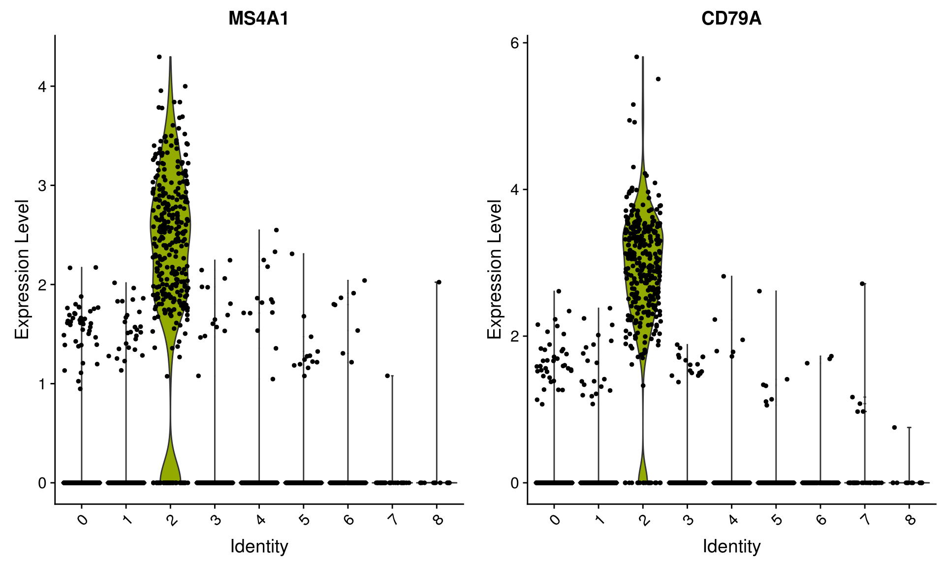
| Version | Author | Date |
|---|---|---|
| fcf3e91 | JonThom | 2019-05-09 |
FeaturePlot(pbmc, features = c("MS4A1", "GNLY", "CD3E", "CD14", "FCER1A", "FCGR3A", "LYZ", "PPBP", "CD8A"))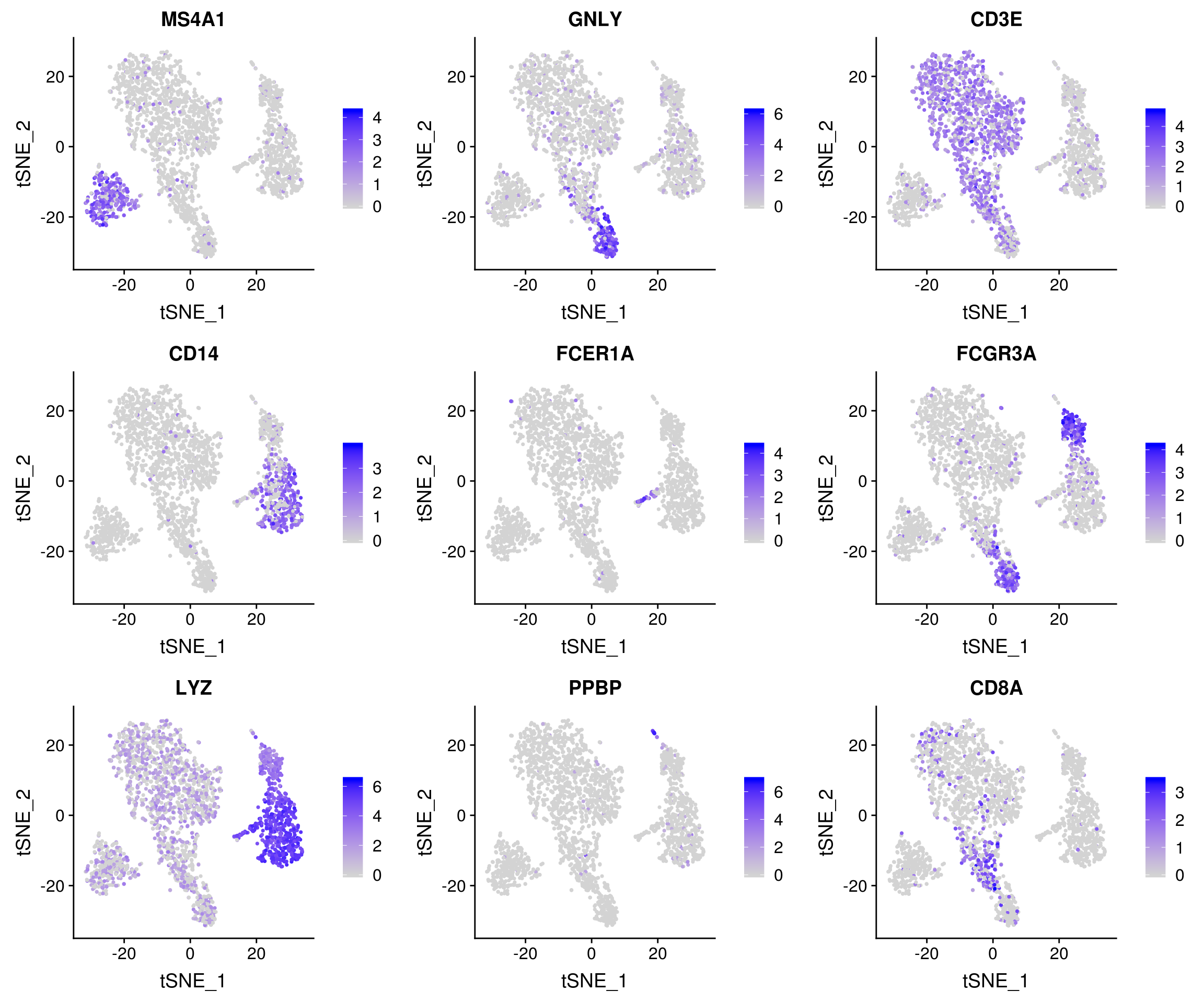
| Version | Author | Date |
|---|---|---|
| fcf3e91 | JonThom | 2019-05-09 |
Assigning cell type identity to clusters
With this dataset, we cheat a bit by using canonical markers to easily match the differentially expressed genes of unbiased cell clusters to known cell types. (An alternative might have been to align the cells against an existing labelled dataset and transfer its labels)
new.cluster.ids <- c("Naive CD4 T", "Memory CD4 T", "CD14+ Mono", "B", "CD8 T", "FCGR3A+ Mono",
    "NK", "DC", "Platelet")
names(new.cluster.ids) <- levels(pbmc)
pbmc <- RenameIdents(pbmc, new.cluster.ids)
DimPlot(pbmc, reduction = "tsne", label = TRUE, label.size = 5, pt.size = 0.5) + NoLegend()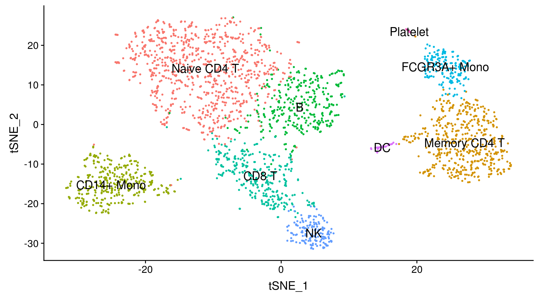
| Version | Author | Date |
|---|---|---|
| fcf3e91 | JonThom | 2019-05-09 |
Wrap up
Save the final seurat object to disk
if (F) saveRDS(pbmc, file = "../output/pbmc3k_final.rds")Additional material
Satija group website - for more tutorials and articles
sessionInfo()R version 3.5.3 (2019-03-11)
Platform: x86_64-pc-linux-gnu (64-bit)
Running under: Storage
Matrix products: default
BLAS/LAPACK: /usr/lib64/libopenblas-r0.3.3.so
locale:
[1] LC_CTYPE=en_US.UTF-8 LC_NUMERIC=C
[3] LC_TIME=en_US.UTF-8 LC_COLLATE=en_US.UTF-8
[5] LC_MONETARY=en_US.UTF-8 LC_MESSAGES=en_US.UTF-8
[7] LC_PAPER=en_US.UTF-8 LC_NAME=C
[9] LC_ADDRESS=C LC_TELEPHONE=C
[11] LC_MEASUREMENT=en_US.UTF-8 LC_IDENTIFICATION=C
attached base packages:
[1] stats graphics grDevices utils datasets methods base
other attached packages:
[1] dplyr_0.8.0.1 Seurat_3.0.0.9000
loaded via a namespace (and not attached):
[1] httr_1.3.1 tidyr_0.8.2 viridisLite_0.3.0
[4] jsonlite_1.5 splines_3.5.3 R.utils_2.6.0
[7] gtools_3.8.1 assertthat_0.2.1 yaml_2.1.19
[10] ggrepel_0.8.0 globals_0.12.4 pillar_1.3.1
[13] backports_1.1.2 lattice_0.20-38 reticulate_1.8
[16] glue_1.3.1 digest_0.6.18 RColorBrewer_1.1-2
[19] SDMTools_1.1-221 colorspace_1.4-1 cowplot_0.9.2
[22] htmltools_0.3.6 Matrix_1.2-15 R.oo_1.22.0
[25] plyr_1.8.4 pkgconfig_2.0.2 tsne_0.1-3
[28] listenv_0.7.0 purrr_0.3.0 scales_1.0.0
[31] RANN_2.5.1 gdata_2.18.0 whisker_0.3-2
[34] Rtsne_0.13 git2r_0.23.0 tibble_2.1.1
[37] ggplot2_3.1.0 withr_2.1.2 ROCR_1.0-7
[40] pbapply_1.3-4 lazyeval_0.2.2 cli_1.1.0
[43] survival_2.43-3 magrittr_1.5 crayon_1.3.4
[46] evaluate_0.10.1 R.methodsS3_1.7.1 fansi_0.4.0
[49] fs_1.2.6 future_1.10.0 nlme_3.1-137
[52] MASS_7.3-51.1 gplots_3.0.1.1 ica_1.0-2
[55] tools_3.5.3 fitdistrplus_1.0-9 data.table_1.12.2
[58] stringr_1.4.0 plotly_4.7.1 munsell_0.5.0
[61] cluster_2.0.7-1 irlba_2.3.2 compiler_3.5.3
[64] rsvd_1.0.0 caTools_1.17.1.1 rlang_0.3.3
[67] grid_3.5.3 ggridges_0.5.0 htmlwidgets_1.2
[70] igraph_1.2.1 labeling_0.3 bitops_1.0-6
[73] rmarkdown_1.10 gtable_0.3.0 codetools_0.2-16
[76] R6_2.4.0 zoo_1.8-2 knitr_1.20
[79] utf8_1.1.4 future.apply_1.0.1 workflowr_1.3.0
[82] rprojroot_1.3-2 KernSmooth_2.23-15 metap_0.9
[85] ape_5.1 stringi_1.4.3 parallel_3.5.3
[88] Rcpp_1.0.1 png_0.1-7 tidyselect_0.2.5
[91] lmtest_0.9-36